2.11.10

Rod and Kate

Dave sent me a whole rake Rodney Tentakle script pages over the past few days, so I'm currently working out the niggly thumbnail stuff so I can try and figure out what way the pages will be laid out once drawn. 

Anyways, I did some sketches while I was doing this. Note the freakishly over-long legs in the Rodney pic.


27.10.10

Doc Tentakle Logo

Just a quick update tonight (my nose is like an open tap right now, thanks to this bloody cold I have. Lovely).


This here is the logo that shows up quite a bit in Rodney Tentakle, it's basically the symbol that Doc Tentakle used quite a bit during his super villain heyday. Dave and I are talking about doing up a kid's version as well, something that looks like Rod took his dad's symbol and messed around with it. I'm still trying to figure that part out but I'm hoping to get a flash of inspiration.

Also, here's some sketches I did while trying to figure out some things.


19.10.10

Brush

'lo all.

It's just over a week since my return from the New York Comic Con and I thought it was high time to get my blog going again. 

To kick things off, I did some sketches of the main characters from a three page story (written by Mike Lynch) I'm working on. It's basically a slightly alternative take on the age-old tale of Red Riding Hood. 


 As you can see, these sketches are rather, eh, messy to say the least. Reason being, I got a brush pen through the post today and decided to give it a whirl. It's been quite a while since I last laid hands on a brush pen and, to be honest, I never did much with my previous pen other than quick doodles. After being so used to inking my work with Microns, I must admit that it is pretty difficult to get used to using something that encourages you to draw both quickly and accurately. However, I'll try and stick with it as I have a feeling that brush inking would suit my current style far better than the rigidity that Microns encourage.

30.9.10

Other Work

Not much of an update today, I'm afraid. Most of my day was taken up with putting together most of the pages of a mini-booklet with examples of my comic art printed inside (including art from both Rodney Tentakle and RiRa, amongst other things). I basically see it as a sort of disposable portfolio that I can hand out to various publishers at the upcoming New York Comic Con, at least that'll give them time to look over my work at their own leisure if they so wish.


I just wish when going into this that someone told me how bloody difficult it is piecing a book like this together. Many a bad word was uttered and the rage was strong in me. However, it has been a valuable experience and I have learned quite a lot, I'll definitely be better prepared next time. Luckily, there are only a few more pages to go, so I'm hoping to have the book printed and bound (with a stapler. Old school, yo) by the end of this weekend.

28.9.10

Narcissism

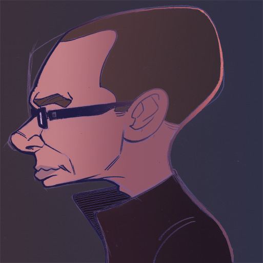
Yet another self portrait/caricature, this time sans-hair in order to reflect my current, eh...'look.'


Also, IN OTHER NEWS, I got my 200 Moo mini-cards today and boy howdy, they sure are purdy!


I'm very, very pleased with how these turned out. The print quality is top notch and everything's clean and legible looking. Most expensive but definitely worth it! So, yeah, I'm going to plug Moo, they deserve it.

27.9.10

Cow Tick

Continuing on in the series of gaming-releated sketch portraits I've been drawing, here's one I did of the games industry equivalent of Rupert Murdoch, Bobby Kotick:


The image I used for reference can be found here.

26.9.10

The Wright Man

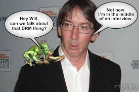
Following on from me and Ty's collaboration on the Miyamoto piece, we decided to try our collective hand at another legend in electronic gaming: Will Wright, the mind behind such franchises as Sim City and (of course) The Sims.

Here are my lines:


You can view the photo I used for reference here.

Originally, I was going to insert (this was Ty's idea) the 'Sims Diamond' (Google it if you don't know what it is) above Mr. Wright's head. However, nothing I drew was really working out. The only design I finished is so far removed from a diamond that it looks nothing like one, but I spent ages at it and it's fairly interesting in its own right, so here it is:


23.9.10

o m g . . .

More hand sketches...


...and what's supposed to be Arthur Guinness (doesn't really look like him, though), seeing as today is Fake Guinness Sham Holiday:


Moving on...d'you remember that caricature I drew a while back of Shigeru Miyamoto (only one of the best and most influential game designers in the world)? Well, the sickeningly talented real life Klingon that is Ty Dunitz decided that he liked my lines so much that he needed to spread delicious digital colours all over 'em.

Here are my original lines...


...and here, ladies and gents, is what my image looks like once Mr. Dunitz is done with it:


Look at it. Look at it! Absolutely superb stuff, wouldn't you agree? I really couldn't have asked for better than this. So, yeah, go over to Ty's blog and tell him I said hello. Also ask him if I can have the Triangaband back, I need its power.

22.9.10

Sleep Deprivation

I never got to post an update yesterday because I was busy not getting any sleep last night due to my pressing need to get some business cards made up for the New York Comic Con. So, I stayed up all through the night before finally hitting the pillow at 8am and getting an hour and a half of a power nap.

Granted, I already have a whole rake of business cards that I got printed for Fan Expo in Toronto last year but, to be honest, there were a lot of glaring errors on said cards (namely, I got the email address wrong and neglected to add my blog address. Much egg on face) and they simply didn't get across the professional sheen I want my cards to have. So, I overhauled my old design from this...


...to this (I haven't received the cards just yet so the original file will have to suffice):


As you can see, I went incredibly minimal with the design -- I just wanted to get the message across without any clutter and I think I succeeded pretty admirably. Also, a shout out to Ty for his helpful advice. Speaking of Ty, watch this space...he's currently colouring one of my sketches and it is amazing, it really is.

Also, since I'm getting these cards printed by MOO, they allow you to get multiple images printed on your cards as well, so I thought (thanks to an idea given to me by Dave) what better imagery to go with than some choice selections from my art for Rodney Tentakle?

I'm just hoping that these things arrive in time for the NYCC, I really can't wait to see how these look 'in the flesh,' so to speak, having different images on these makes them almost feel like trading cards.

In other news, I updated the design for one of the Rodney Tentakle baddies after getting some good pointers from Dave. I'm really happy with how this turned out as it has a far more distinctive look than its previous iteration. Here's the original design...


...and here's the rejigged version...

I even decided to crank out the markers and do a bit of colouring by hand, which was fun and refreshing.

Finally, I promised I'd do some form of hand sketches every day, so here's my attempts from yesterday (pretty lacklustre, to be honest, got to try harder!):


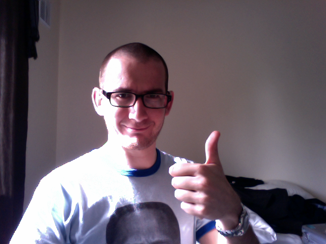
Oh, and I got sick of my hair, so I decided to give it its marching orders:

A-Ok, number 1!

20.9.10

Rogue Hands

I spent today sketching up various designs for some of the Rodney Tentakle Rogue's Gallery. I'll be doing a pinup piece that will feature quite a few of the dastardly fiends, so I wanted to get their designs clear in my head before I get started on that picture.


Oh, I also did some sketches of my hand. If there's one thing that stumps me in drawing, it's hands. I'm ok at drawing them, for the most part, but I definitely could be a hell of a lot better. So, for the next while, I'm going to try and do at least one hand sketch per day.

17.9.10

MMMM

In my various updates related to Rodney Tentakle, I haven't really touched upon the extensive rogue's gallery that Dave has put together for the story's universe. They are an interesting bunch to say the least! Encompassing everything from ancient gods, to sentient humvees right down to electric cat ladies.

One of my favourite of the bunch, though (their description, in particular, was of the things that turned me on to the comic when Dave pitched it to me) are the 'Mechamechamangamen,' hyper-cute automatons that hide a majorly mean streak beneath their sugar-coated exterior. Basically, like an M&M that has a hidden layer of explosions and death instead of chocolate.

With a name like the (deep breath) Mechamechamangamen, I couldn't help but give these little guys a heavily Japanese animated look. I took inspiration from classic Japanese creations such as Tezuka's famous Astro Boy, to the not dissimilar videogame character Megaman.


My design process is pretty clear on these two pages. I tend to begin with a page of doodles and messy sketches as I try to figure out what the character will look like. Sometimes it'll take quite a few pages to strike upon a design I like, other times (like in this case) I sort out a design pretty quickly.

Once that's done, I do a page with a more refined version of the character. I try to find out as I go along certain little details (such as, in this case, the underlying robotic-skeletal structure of the character). I might also do an animation-esque turnaround of the character, just to get a good idea in my head of how the character will look in 3D space.

16.9.10

The Rat

In honour of the pope's visit to the UK today, I decided to do up a loving portrait of this great man.

My, but isn't he a friendly looking sort?

EDIT: Oh, in case you're interested, here's the image I used for reference.

Electric Mouse

One final update before I hit the hay.

I did these while watching TV. Been quite a while since I've done that, in fact, last time was when I was in Toronto. Nice to just let the drawing hand do its own thing and seeing what comes out.

15.9.10

And here. We. GO.

With only a few weeks until the New York Comic Con, I decided it was high time to shift my arse in gear and get some Rodney Tentakle pinups done. The pages I have done for the comic are all well and good, but there's something about some nice looking pinups/cover art that just sort of fleshes out the package, you know?

As you can see, my process is pretty sketchy - I keep things loose and just let myself go with the flow. Sometimes this works, other times no. In the first image, I had a pretty concrete idea in my head that I simply transferred to paper. The second page, on the other hand, is a lot looser, with me basically putting pen to paper and seeing what happens (you'll notice as well that I've messed around with a possible new design for the story's Yeti characters).


Oh, also, while I have your attention, a certain someone is colouring one of my drawings. I'm not going to tell you who's doing the work or which piece they're colouring just yet buuuuut...let's just say I've seen a work-in-progress and have been blown away! Watch this space!

14.9.10

O' Tec

The ol' creative juices weren't flowing so well today so I think I'll spend tomorrow doing some basics: contour drawing, quick sketches of the human body...that sort of thing. My drawing still feels way too stiff in places and I need to rectify that. I'm also hoping to get started on some Rodney Tentakle-related pinups, get them done in time for my trip to the New York Comic Con next month.

As you can see, I started a pic of Judge Dredd but left it unfinished as, to be honest, it wasn't really going anywhere interesting (well, aside from the slight redesign I gave his costume). I also did up a quick sketch of Manotec.

13.9.10

Spoon

Drew this up for a Spawn fan. Original sketch first, rejigged version second:

12.9.10

Kid Gloves

I'm currently staying at my uncle's place after having a few tipples last night. One of his girlfriend's kids is a HUGE superhero fan -- Superman, Batman, IronMan...you name it, he's into them.

So, I decided to knock out two sketches for the kid when I got home last night, I only managed to get two done in my bleary state but I'm hoping he gets a kick of out 'em! Oh, pardon the crappy webcam pics, I only have access to a small webbook with no scanner so this is the best I can do.

10.9.10

Mob

I'm rather taken with the cult indy PC/Mac title by the name of 'Minecraft,' a game that drops you into a close to infinite sized world and let's you rebuild it as you see fit, all while fighting off the dreaded 'Mobs,' various horrible creatures that want to make you more familiar with a concept known as death. It's basically every Lego play session you had as a kid only on an even grander scale, I fully encourage you try it out!

Anyways, on that subject, I decided to put together my own interpretation of some of the Mob creatures as seen in the game -- from left to right, we have the Slime, the dreaded (and pretty much one of the game's most iconic creations) Creeper and finally, the bog-standard skeleton.

Looking at the piece, I notice that my drawing of the Creeper is...er...how do I put this...kind of phallic looking? Entirely unintentional, I assure you!

Moto

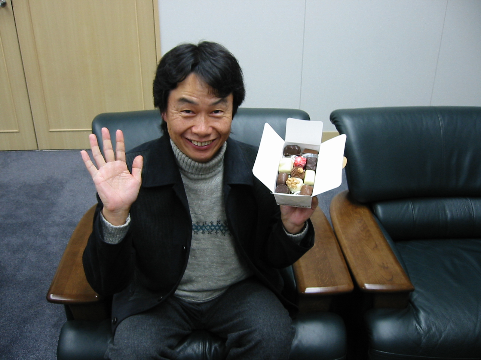
This guy (Shigeru Miyamoto) is probably one of the most famous game designers in the world but god DAMN is he a scary looking mother...

Click here to view the image I used for reference.

8.9.10

Mega Rock

One more pic before I call it a night.

I'm sure any of you that are any way knowledgeable about videogames will recognise where I got my inspiration for the following:

Tentakle Redux

Long time no see, eh?
Apologies for my long, lonnnnng absence...long story short: I had major art block. It's gone now.

In preparation for my trip to the New York comic con next month, I decided to go back over my character designs for Rodney Tentakle and give them a spit and polish, bring them up to date with where my style is at right now. Of course, the first characters I laid my hands on were Rodney and his dad, Doctor Tentakle. I didn't do anything too drastic, I just tried to simplify and streamline their designs -- some of my previous choices were overly busy, so I toned those elements back.

I'll be working on the various other characters over the next few days, so keep your eyes peeled for updates!

Right, on to the pics:


29.6.10

Someone to watch over me...

After a bit of a hiccup a while back (ie. Zuda stopped taking submissions until the end of the summer), I'm finally putting the finishing touches to Dave and I's Rodney Tentakle pages. I've most of the hard work done on the final three pages and it's just a matter of adding some lighting effects to the pages in order to give them that extra bit of polish. Knowing me, I'll give pages 1 to 5 a once-over and redo a few things I may have missed, otherwise it's plain sailing from here on in.

So, to tide you lot over, here's a panel from page 8. I'm particularly proud of this one as it just looks...nice. I'm sure that in a year's time, I'll look back on it and go 'bleeeurgh,' but for now, I'm quite happy with it.

18.6.10

Shock. HORROR.

What's this? A-An...update? Yeah, hello there. I've been letting my little corner of the web gather a bit of digital dust for far too long now so I thought what better way to update than to show you my latest bit of comic work? The following page was written, yet again, by the shifty looking Dave Hendrick. He gave me a choice of three scripts and I chose this one because it was silly, allowed me to draw cool looking future tech and it reminded me of the best of 2000AD's classic 'Future Shock' stories. So, yes, here you go. I do have a version with the text added and what-not but you're just going to have to wait a bit longer before you get to see that -- I wouldn't want to spoil the surprise now, would I?