
Granted, I already have a whole rake of business cards that I got printed for Fan Expo in Toronto last year but, to be honest, there were a lot of glaring errors on said cards (namely, I got the email address wrong and neglected to add my blog address. Much egg on face) and they simply didn't get across the professional sheen I want my cards to have. So, I overhauled my old design from this...

...to this (I haven't received the cards just yet so the original file will have to suffice):

As you can see, I went incredibly minimal with the design -- I just wanted to get the message across without any clutter and I think I succeeded pretty admirably. Also, a shout out to Ty for his helpful advice. Speaking of Ty, watch this space...he's currently colouring one of my sketches and it is amazing, it really is.
Also, since I'm getting these cards printed by MOO, they allow you to get multiple images printed on your cards as well, so I thought (thanks to an idea given to me by Dave) what better imagery to go with than some choice selections from my art for Rodney Tentakle?
 I'm just hoping that these things arrive in time for the NYCC, I really can't wait to see how these look 'in the flesh,' so to speak, having different images on these makes them almost feel like trading cards.
In other news, I updated the design for one of the Rodney Tentakle baddies after getting some good pointers from Dave. I'm really happy with how this turned out as it has a far more distinctive look than its previous iteration. Here's the original design...

...and here's the rejigged version...
 I even decided to crank out the markers and do a bit of colouring by hand, which was fun and refreshing.
Finally, I promised I'd do some form of hand sketches every day, so here's my attempts from yesterday (pretty lacklustre, to be honest, got to try harder!):

Oh, and I got sick of my hair, so I decided to give it its marching orders:
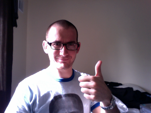 A-Ok, number 1!


